Step by Step Guide to Design Beautiful Careers Page
Companies tend to focus heavily on creating a fantastic experience across web and mobile for their customers and partners but not so much on prospective candidates. Why is that? A shoddily designed careers page can give the impression that you probably don’t care about candidates and employees much. Delivering a path-breaking candidate experience often starts with designing a beautiful careers page.
What does it take to design an amazing careers page?
Of course, there is no standard formula to do this. But, there are a few things that will help you think creatively about your communication strategy. Let’s discuss a few must-haves and look at companies who absolutely nailed it.
Also, check How to Develop a Data-Driven Recruiting Strategy
Who are you? – The Company Introduction
Imagine you had just three seconds to tell a prospective candidate about your organization, What would you do to get them interested? As the old adage goes, a picture is worth a thousand words. The purpose of this section is to create a great first impression and display your identity. Uber does it beautifully.
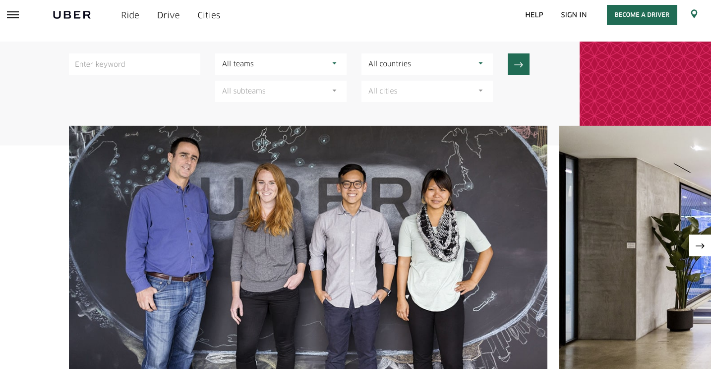
It has all the essential elements which push the candidate to scroll further and move to the next section. The first image is of a happy diverse group of people standing in front of a map of all cities where Uber operates. As you move down the slider, you can see more images of people walking their dogs in the office or having fun at work. Each image has been carefully chosen to subtly communicate that we are an open diverse and fun place to work.This thoughtful presentation reflects a well-planned web development process focused on user engagement and brand storytelling.
What do we want to achieve? – The Vision Statement
Each company has a unique vision and the entire team is vested in that vision. Putting it right out there enables you to get the candidate invested in the vision right from the beginning. It is also a great filter to find people with the right cultural fit.
Also, check How I built a team of 40 amazing people in 1 year
The entire world probably knows about SpaceX! For an organization like SpaceX or even yours, it’s highly important that candidates know the vision of the company before they apply and decide whether they want to contribute to that vision or not. SpaceX nails the vision statement on its careers page.
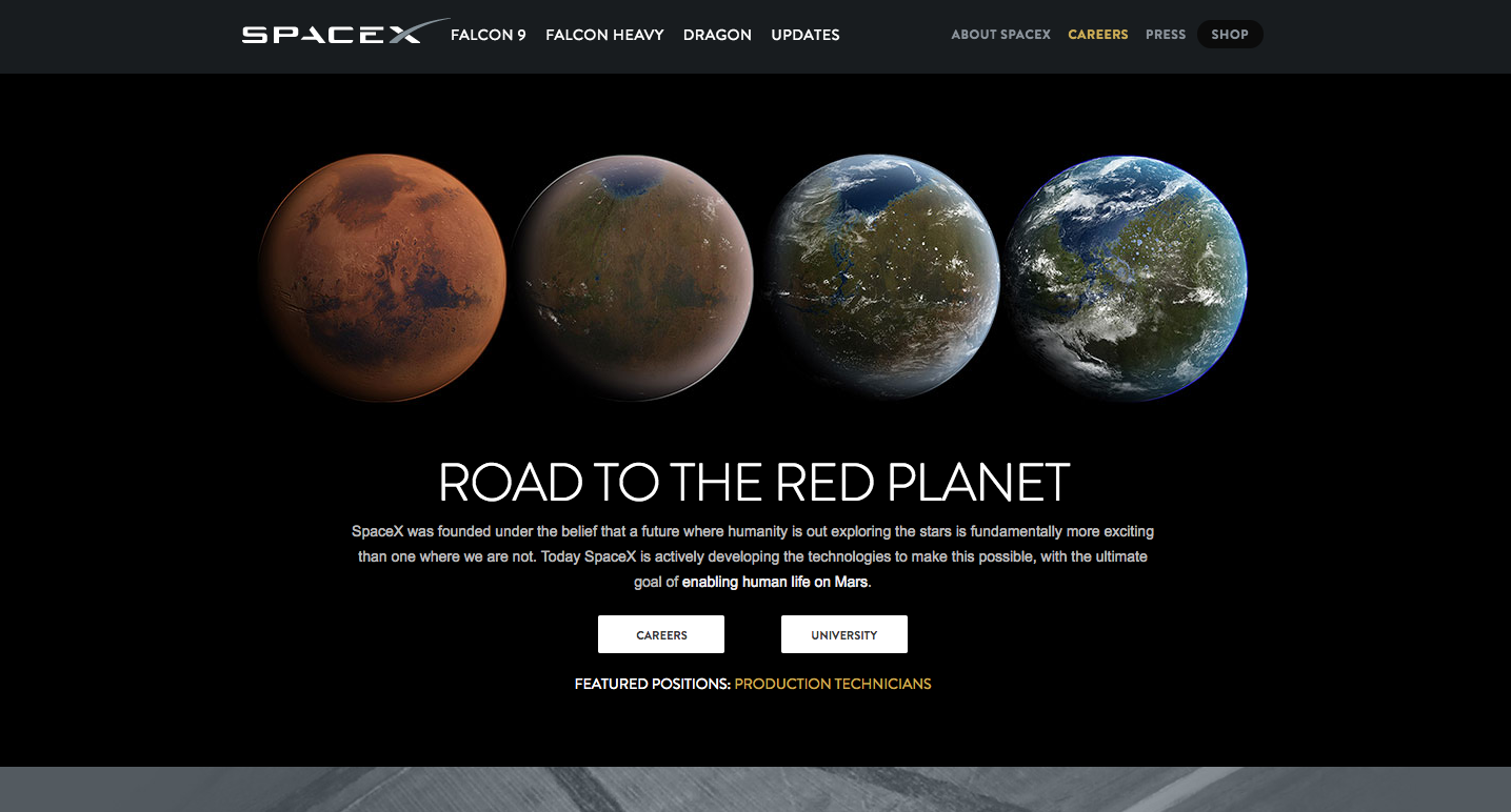
Ideally, the vision shouldn’t be more than 2-3 lines and should drive interested candidates to the culture of the company and the people they would be working with.
Check our blog to Create a Candidate Persona to Hire Better
What is it like to work here? – The culture
A company is defined by its culture. Candidates are reserved about the new work environment. This is especially true for really great passive candidates. They don’t just want to work for the company but they want to be part of the culture-driven towards a vision. You want to clearly define what kind of people will make a perfect team fit for your company.
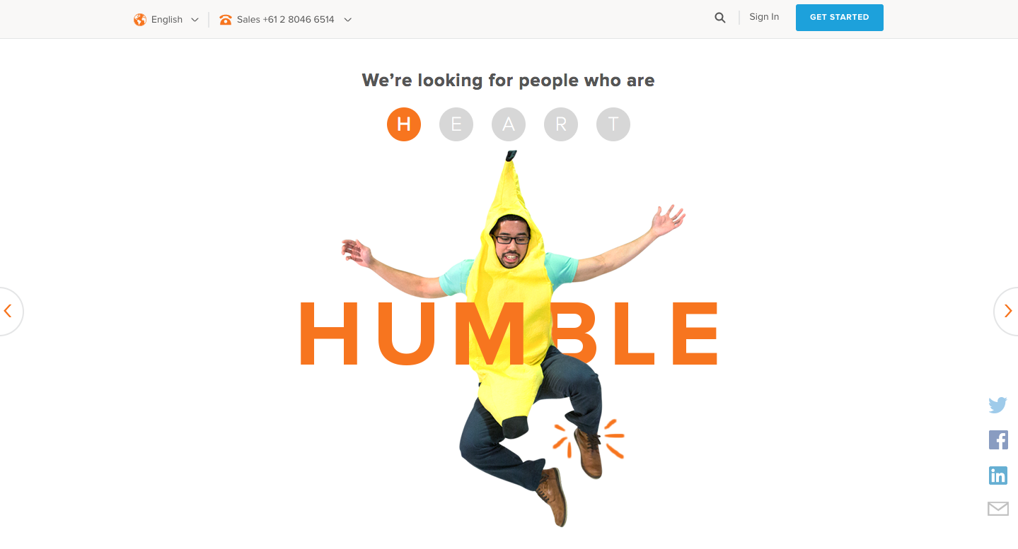
Hubspot, the leading marketing automation, and CRM tool define its culture by HEART ( Humble, Effective, Adaptable, Remarkable, Transparent) and they want people who possess these characteristics to join their team. It is not the values but the way they deliver the message that takes the prize.
People
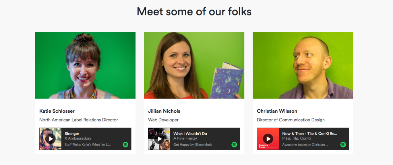
Your people are the soul of your organization. A prospective candidate wants to know the people she will be spending the majority of her time with. For them, it’s their future colleagues and friends. This is a major opportunity to build familiarity and ease the candidate into considering working at your organization or at least take that call next time someone from your organization reaches out to them.
Music streaming company Spotify understands this and has a separate section for people who work at Spotify. The profile not only shows what their role is but also gives a small glimpse of what they are like. What better way to do this than music and trust Spotify to get it right! They attach a song the person identifies within their introduction. Imagine you and your colleagues sharing the latest bands you found and playlists right across the desk!
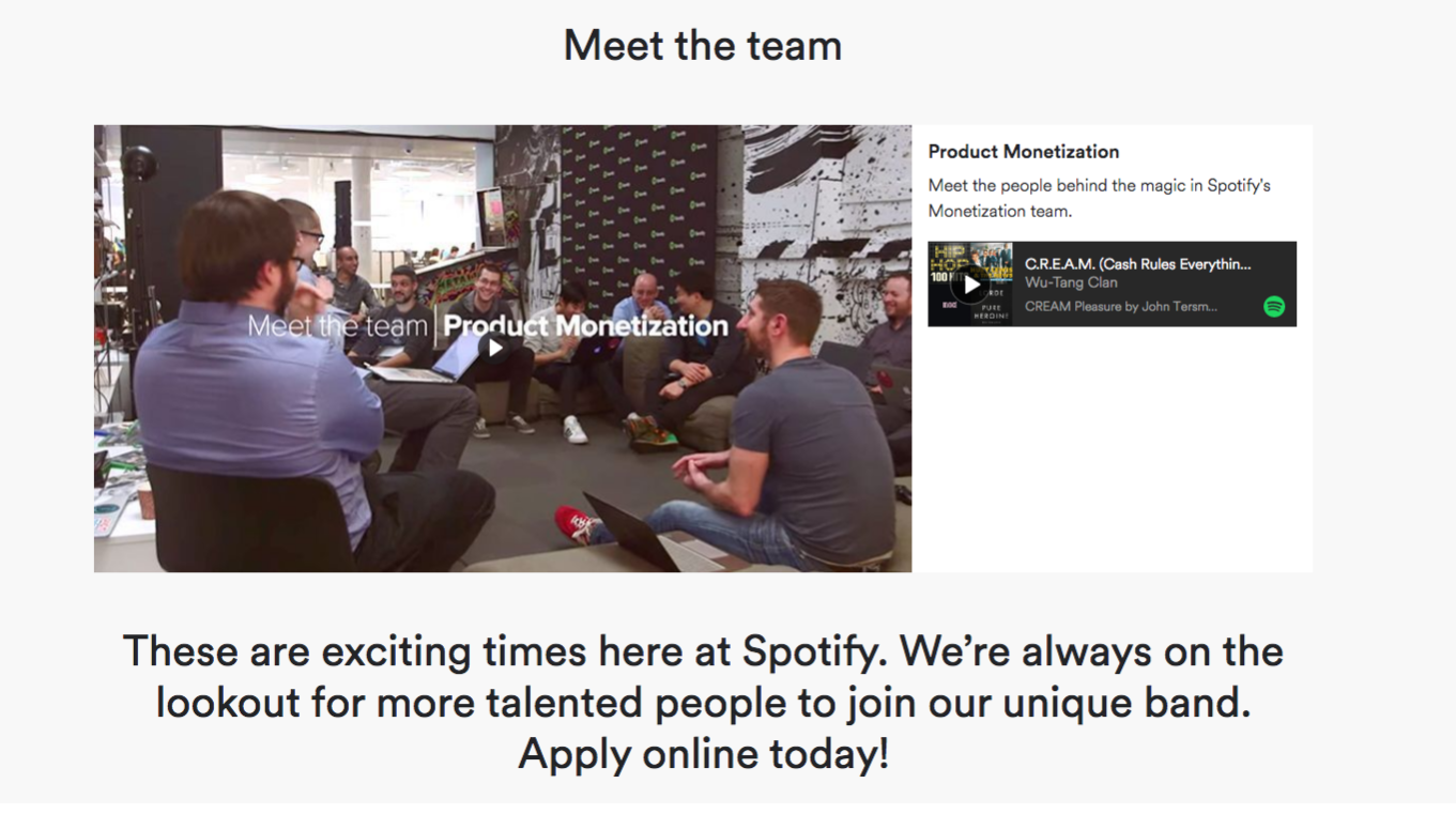
Spotify goes one step further here and also has a section dedicated to various teams at Spotify. To top it off, they brilliantly use videos to give a better feel of the team and work environment.
Is there something for you? – Openings
The prospective candidate is now invested in your vision, relates to your culture, and loves your team so half the job is done. Moreover, suppose you use WordPress as your CMS. In that case, you can configure WordPress to send email notifications to both the candidate and your team whenever an application is submitted, streamlining communication and improving response times. However, in order to successfully convert visitors to a candidate (much like sales), you need to make a landing page that is optimized for openings where they can scroll through job listings, read job descriptions, and easily apply. Make sure you have a visually appealing website design with correctly created filters of location, team, and commitment level so that candidates can quickly sift through openings and find the relevant ones for them. Also, ensure that you have a cool logo present. The colors, layouts and fun logo font make it appealing. Application via social platforms like LinkedIn, Github, and Angellist drastically reduces the friction to apply and dramatically increases conversions. Moreover, if you use WordPress as your headless CMS, you should also speed up WordPress so that your website visitors will have the greatest experience. Additionally, react web development can enhance the interactivity and responsiveness of your site, creating a more engaging user experience. You can always outsource this task to someone who has started a web development business, which may help you save time, money, and effort if you lack the knowledge and time to create a beautiful website.
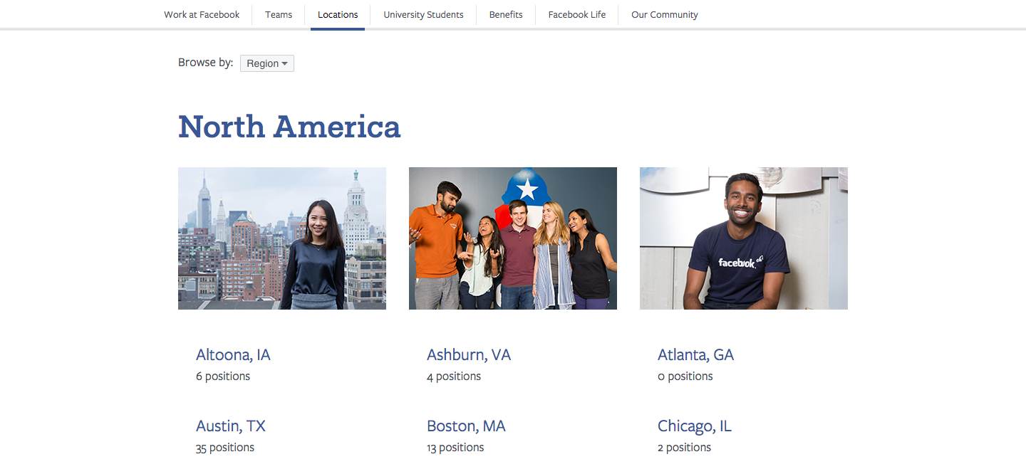
Facebook has multiple departments present across various locations. For them, it’s essential that the candidate can easily navigate to the relevant department and location. Candidates can easily navigate between various teams and locations on their career sites. It’s just a click away!
Candidates can browse through the location
Browsing through various departments is also a click away!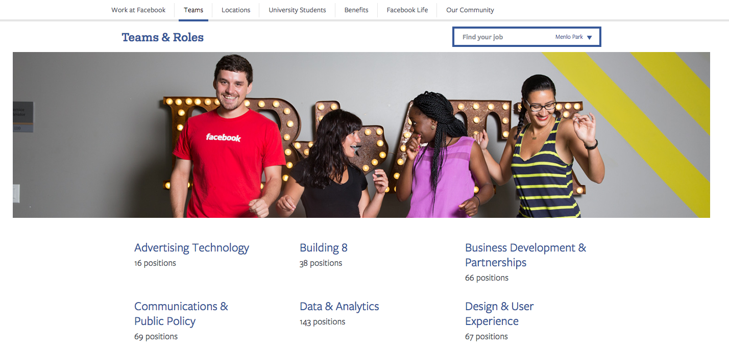
Bonus Tips:
- Create a mobile-friendly careers site and pick a hosting, that can handle the increased traffic. More than half the visitors visit your careers page on a handheld device and will leave immediately if the experience is not seamless.
- Have a good about us page in parallel with having a superb career page. It is the perfect place for the candidates to know that you are a legitimate company that stands behind what you promise.
- You can also add videos in various sections.
- There will be times when a great candidate won’t find any relevant opening. You should have the option to subscribe to your career updates so that you don’t miss out on these candidates.
- Enable social sharing on your job page allowing visitors to refer their friends who they think can be a great fit for your role.
- Keep your application form short and simple. Once the candidate is in the pool, you can always have conversations and get more information about them later.
Use Recruiterflow to get a beautiful careers page without any coding.
Get Started for Free.
Learn More about Recruiterflow
Recruitment

